
Infographics
Data Visualization & Infographic Design, Information Architecture, Scientific & Technical Communication, Global Health Contextualization, Brand-Aligned Visual Strategy
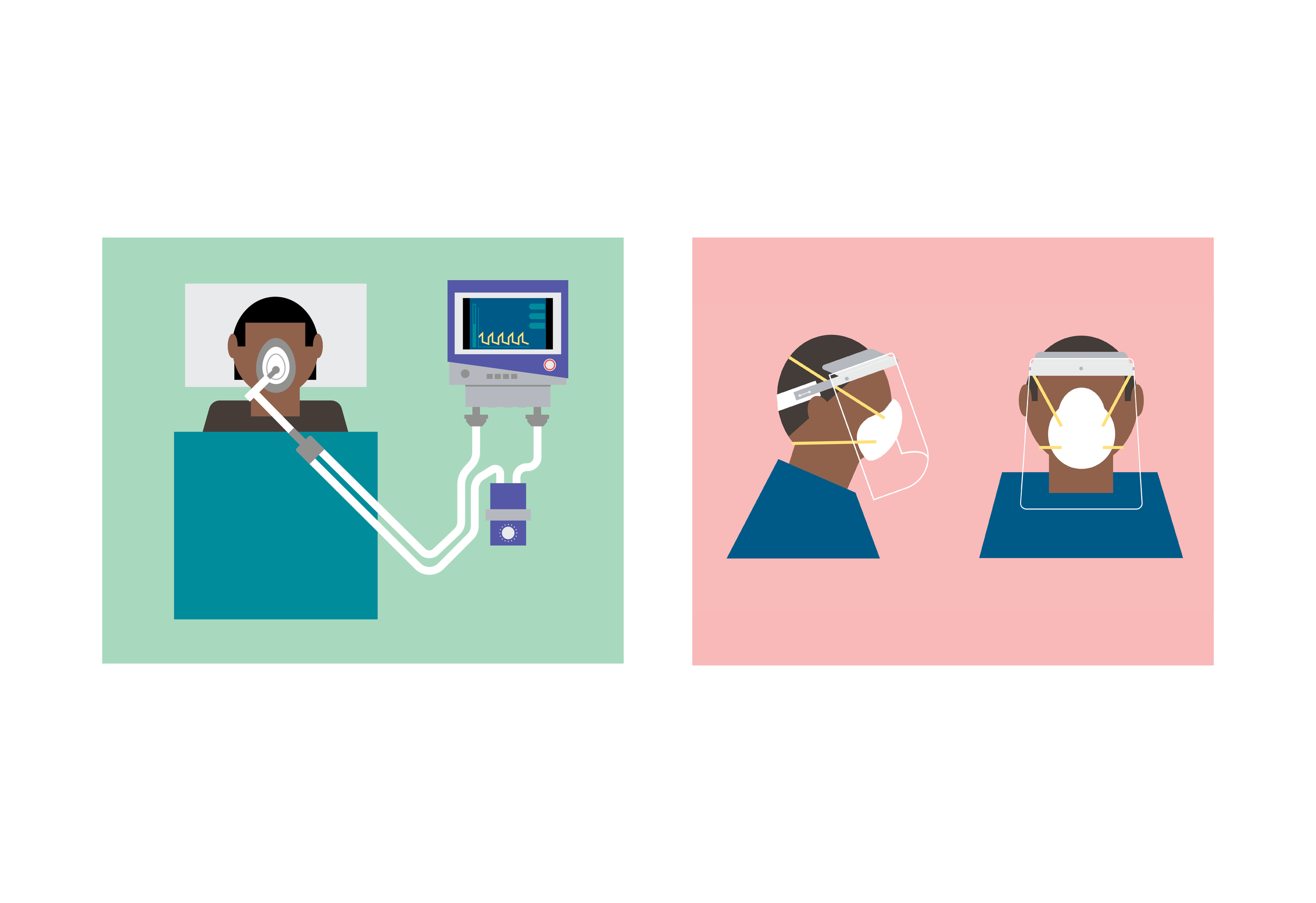
This collection showcases a range of infographics and data visualizations created to distill complex global health data into accessible, engaging formats. Each piece was designed with clarity and flexibility in mind, addressing diverse communication goals—from illustrating vaccine development timelines and health strategy frameworks to mapping disease burden and service access across countries. The visual formats span linear processes, comparative graphics, circular diagrams, maps, and timelines, tailored to meet both technical accuracy and audience comprehension. These visuals supported PATH’s strategic storytelling, donor engagement, and program communication goals, while maintaining consistency with brand elements such as color, typography, and iconography. The life story infographic is a personal project that visually chronicles my father’s journey from birth to age 40. Designed as a tribute, the piece blends timeline structure with geographic mapping to highlight key milestones, locations, and life events in a clear and compelling narrative.